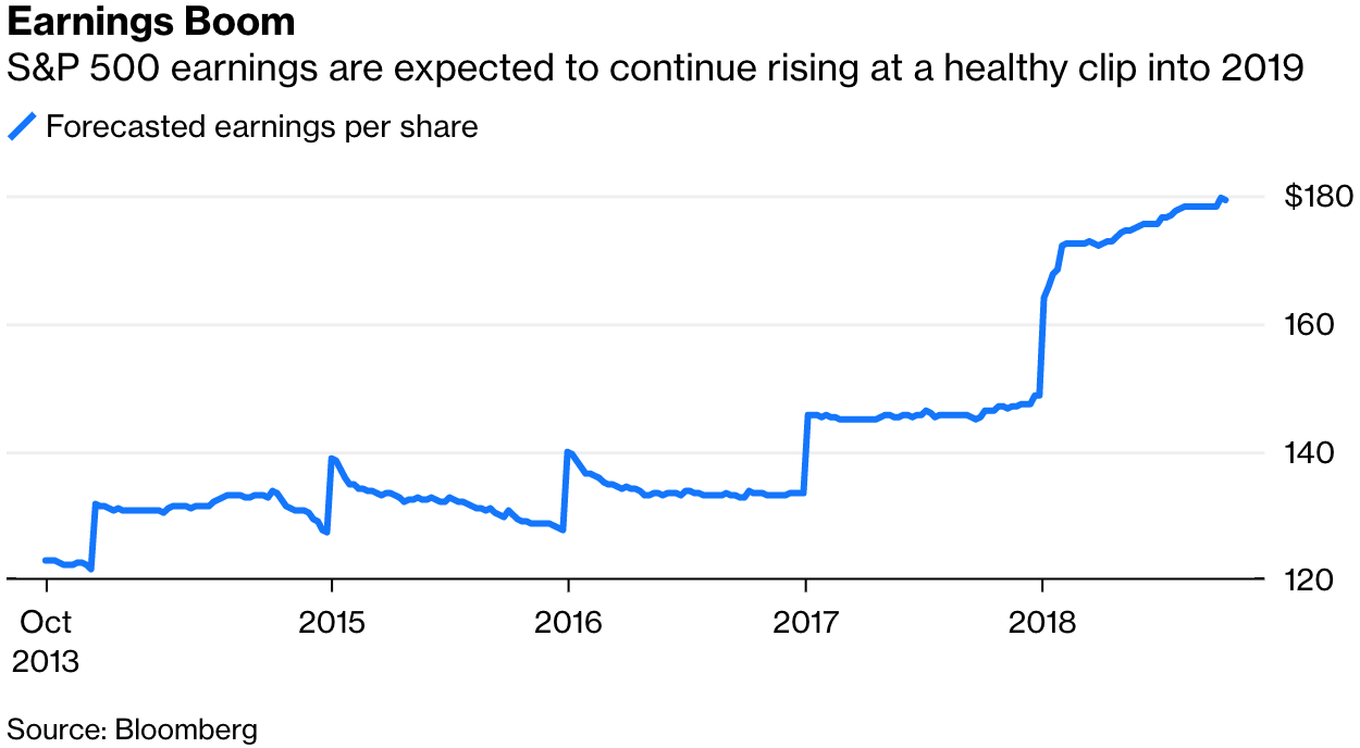
According to the author, this chart shows that earnings per share of the 500 stocks of S&P 500 increased. It seems that the surge in earnings is satisfying. However, the return showed in the chart is a absolute term, which doesn't take into account
the time value of money. I re-made the chart below.
As you can see, I add the market require rate, which refers to the minimal return rate that the market requires. Earnings of S&P 500 are smaller than the require rate. This chart actually leads us to a opposite conclusion, that is, the stocks in S&P
500 didn't perform well.
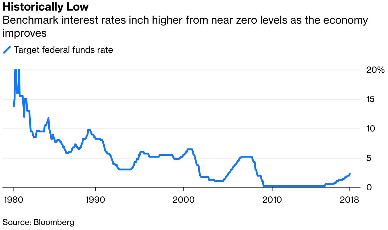
The aurther used this chart to show that the Fed Funds Rate is rebounding from its low base. It seems that the rate has been plunged significantly during the recent decades. However, the fact is the starting date of the chart, 1980s, represents the
historical peak of the Fed Funds Rate. Readers may be confused and think the rate nowdays is abnormal.
I changed the chart by chose an earlier date, 1960s. As you can see from the chart, the rate in 1960s was also very low and the peak of the rate in 1980s was abnormal.